
Blog
Google Logo Meaning: Complete Typography Breakdown
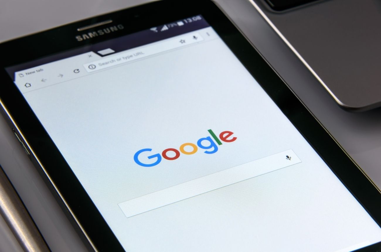
The Google logo is one of the most recognizable designs in the world. With billions of people interacting with Google every single day, the logo has become more than just a visual identity—it’s a cultural icon. Yet, what many people overlook is the deep thought process, typography details, and design evolution behind it. From its early beginnings in 1998 to the modern minimalist version we see today, the Google logo has undergone subtle yet meaningful transformations. Each change has brought clarity, balance, and accessibility, ensuring that the brand communicates innovation and trust while remaining approachable.
In this article, we’ll explore the meaning behind the Google logo, the typography choices that define it, the symbolic use of colors, and newly discovered details about its design evolution. By the end, you’ll have a clear understanding of how one of the world’s most powerful companies created a visual identity that resonates with everyone, from schoolchildren to business leaders.
The Origins of the Google Logo
The story of the Google logo begins in 1997 when Larry Page and Sergey Brin were developing their new search engine. Originally called BackRub, the project needed a fresh identity once the company decided on the name “Google,” inspired by the mathematical term “googol,” which represents the number 10 raised to the power of 100. This concept symbolized the immense amount of data the search engine aimed to organize.
The first Google logo, created in 1998, was simple and had a very amateur feel. It used the Baskerville Bold font with basic primary colors. Interestingly, the logo even had a playful exclamation mark, resembling Yahoo!’s branding at the time. This early design may not have been polished, but it laid the foundation for the colorful identity that would define Google’s brand.
Evolution of the Google Logo
Over the years, the Google logo has undergone several refinements to match the company’s growth and philosophy. Here’s a quick breakdown:
1998 – The Original
The first official logo used Baskerville and a playful design. While amateurish, it signaled the beginning of a brand that would later dominate the internet.
1999 – The Catull Typeface
By 1999, Google switched to the Catull font, a serif typeface known for its classical elegance. This version became the longest-running Google logo, lasting until 2015. The distinctive “G” with its sharp serifs became iconic during Google’s rise.
2010 – Subtle Refinement
Google introduced slight shadows and gradients to modernize the logo, making it appear more three-dimensional. This aligned with the design trends of the time.
2013 – Flattening the Design
As flat design became popular across tech companies, Google adopted a flatter look. Gradients and shadows were removed, creating a simpler, cleaner design that worked well across digital platforms.
2015 – Sans-Serif Revolution
In September 2015, Google unveiled a major redesign. The company switched from Catull to a custom-designed sans-serif font called Product Sans. This was a bold step toward minimalism, ensuring the logo was highly legible across screens, from smartphones to smartwatches. This is the version we know today.
Typography Breakdown: The Shift to Product Sans
The typography of the Google logo is not random—it reflects the company’s values.
-
Product Sans is a geometric sans-serif typeface designed in-house by Google’s design team.
-
The rounded forms of each letter convey friendliness and accessibility. Unlike rigid serif fonts, Product Sans makes the brand approachable, which aligns with Google’s mission of “making information universally accessible.”
-
The spacing and proportions are carefully balanced for digital readability. Each letter has subtle tweaks to appear optically correct, even though it may not be mathematically perfect.
Key Typography Details:
-
Letter “G”: The uppercase “G” is bold and open, symbolizing inclusiveness and global reach.
-
Double “o”s: Their circular design conveys simplicity, mirroring the idea of infinite possibilities.
-
Letter “l”: Its upright stance reflects stability and reliability.
-
Letter “e”: Slightly tilted, it adds a playful touch, showing Google’s balance between professionalism and creativity.
This combination makes the Google logo instantly recognizable while maintaining a friendly personality.
The Color Palette and Its Symbolism
No discussion about the Google logo would be complete without its colors. The design uses a sequence of blue, red, yellow, and green. Unlike most brands that stick to two or three core colors, Google embraced a four-color scheme.
-
Blue (G & g): Represents trust, knowledge, and stability.
-
Red (o & e): Symbolizes energy, passion, and innovation.
-
Yellow (o): Stands for optimism, creativity, and fun.
-
Green (l): Signifies growth, balance, and accessibility.
Interestingly, Google intentionally broke the pattern with the green “l.” Instead of following a strict primary-color pattern, the green symbolizes breaking rules and thinking outside the box—core principles of Google’s identity.
Why Typography Matters in Branding
Typography isn’t just about fonts; it’s about communication. For a company like Google, whose products are used by billions, readability is critical. The shift to sans-serif in 2015 marked a turning point not only for Google but for digital design in general. Other companies soon followed, adopting similar minimalist styles.
The Google logo typography ensures:
-
Consistency across platforms (desktops, tablets, phones, and even smart devices).
-
Clarity for users worldwide, regardless of language or literacy level.
-
Approachability, making a tech giant feel less intimidating.
Google Doodles: A Typography Playground
One unique aspect of the Google logo is the famous Google Doodle. These variations, celebrating events, people, and holidays, show the logo’s flexibility. Typography in doodles often bends, stretches, or transforms while remaining recognizable. This reinforces how strong the foundational typography is—the letters can morph, yet the brand remains intact.
Newly Discovered Insights into the Design Process
Recent design notes and interviews with Google’s creative team reveal some fascinating details about the Product Sans logo design:
-
The font was tested extensively at small sizes to ensure it looked clear on wearable devices.
-
Designers intentionally avoided sharp angles, believing curves evoke friendliness.
-
The tilted “e” was the subject of multiple debates but was ultimately kept to highlight Google’s playful side.
-
Accessibility played a major role. Designers made sure the logo was color-blind friendly by testing contrasts and brightness across different screens.
These small but important choices explain why the Google logo feels modern yet timeless.
How the Google Logo Influences Branding Worldwide
The impact of the Google logo extends beyond the company itself. Many tech firms have adopted similar sans-serif designs after 2015, including Spotify, Airbnb, and Pinterest. Google’s bold move away from serifs influenced a wave of minimalism across the digital world.
It also shows that branding doesn’t need to be flashy—simplicity, when executed well, can become powerful and iconic.
Conclusion
The Google logo is more than just a wordmark—it’s a visual representation of a company that has reshaped how we access knowledge. From its early playful beginnings to the refined Product Sans design, every detail in its typography and color palette carries meaning. The bold shapes convey friendliness, the tilted “e” shows playfulness, and the diverse colors symbolize creativity and innovation.
Typography, often overlooked, is the backbone of Google’s brand identity. It makes the logo recognizable across the globe, adaptable in doodles, and timeless in its appeal. As Google continues to innovate, its logo stands as a reminder that even the simplest design choices can carry immense meaning.

Tennis Chain Durability: Diamond Setting, Structural Strength, and Long-Term Wear

3 Steps to a Successful Quinceanera

Building Stronger Communities Through Corporate Partnerships

Understanding Professional Networks for Expert Knowledge

General Audience: Key Considerations When Evaluating Ai Orchestration by Ba Insight

Creating Outdoor Spaces That Balance Comfort, Atmosphere, and Weather Resilience

How a Trust Lawyer Ensures Your Wishes Are Legally Enforceable

How NetSuite Automates Revenue Recognition

Business Professionals: Key Considerations in Microsoft Exchange Server Integration for Search

The Lifestyle Habits That Actually Help Your Skin Look Healthier and More Radiant

Christina Erika Carandini Lee: A Life of Grace, Heritage, and Privacy

Nick Schmit? The Man Behind Jonathan Capehart Success

Trey Kulley Majors: The Untold Story of Lee Majors’ Son

Jamie White-Welling: Bio, Career, and Hollywood Connection Life with Tom Welling

Api Robin: The Quiet Force Supporting Celeste Barber

Melanie Sergiev: The Woman Behind Drew Lynch’s Success Story

Linda Bazalaki — Life After the Crown, Miss Uganda 1993

Vera Davich: The Enigmatic Life of Scott Patterson’s First Wife

Kamiri Gaulden: What You Should Know About NBA YoungBoy

Talia Elizabeth Jones: Her Life, Parents, and Connection to Davy Jones
Tennis Chain Durability: Diamond Setting, Structural Strength, and Long-Term Wear
3 Steps to a Successful Quinceanera
Building Stronger Communities Through Corporate Partnerships
Understanding Professional Networks for Expert Knowledge
General Audience: Key Considerations When Evaluating Ai Orchestration by Ba Insight
Creating Outdoor Spaces That Balance Comfort, Atmosphere, and Weather Resilience
How a Trust Lawyer Ensures Your Wishes Are Legally Enforceable
How NetSuite Automates Revenue Recognition
Business Professionals: Key Considerations in Microsoft Exchange Server Integration for Search
The Lifestyle Habits That Actually Help Your Skin Look Healthier and More Radiant
-
 Celebrity11 months ago
Christina Erika Carandini Lee: A Life of Grace, Heritage, and Privacy
-
 Celebrity11 months ago
Nick Schmit? The Man Behind Jonathan Capehart Success
-
 Celebrity11 months ago
Trey Kulley Majors: The Untold Story of Lee Majors’ Son
-
 Celebrity12 months ago
Jamie White-Welling: Bio, Career, and Hollywood Connection Life with Tom Welling